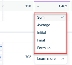
Using Time Aggregation and Relative Comparisons

Overview

xP&A offers different functionalities to compare or aggregate your data in order to gain deeper insights, identify trends, and support strategic decision-making across planning and analysis workflows.

This article contains the following sections:

Time Aggregation

In charts and tables, and in the roll-up columns in a spreadsheet, xP&A can automatically aggregate a variable's values across time.

Example: If your model is monthly and you have a Revenue variable, then xP&A can automatically summarize the total revenue in each year.

The time aggregation function lets you choose how this summary is calculated. The following options are available:

  • Sum
    Sums up the individual values, e.g. anything that represents a discrete quantity which can accumulate, e.g. "Revenue"
  • Average
    Calculates the mean of the individual values, e.g. generally anything that's a percentage, like "Growth rate"
  • Final
    Takes the final value in the set of individual values, e.g. anything representing an accumulation, like "Total users" or "Cash in bank", or a percentage that you expect to move roughly monotonically
  • Initial
    Takes the first value in the set of individual values
  • Formula
    Uses the variable's formula to calculate an aggregation value, e.g. if you have a variable for the margin with the formula profit / revenue, the formula aggregation will take the total profit and divide it by the total revenue of the aggregated period.
     

You can set up the time aggregation as follows:

In charts and tables

Right-click a variable and choose Aggregation | Time Aggregation and then the desired aggregation methods from the context menu:

Time aggregation menu on a variable

In roll-up columns

If you have roll-up columns toggled on, you can click a rollup cell to easily edit the Time aggregation setting for each variable:

Time aggregation menu on a roll-up column
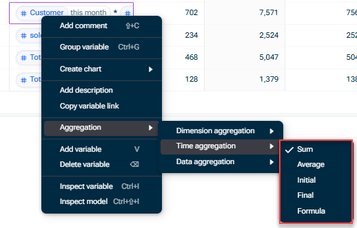
  • Note that the time aggregation setting of a variable also determines how a variable is 'rolled up' to a model with a higher-level granularity.

    For example, when a model with lower granularity (such as Monthly) pulls data from a model with higher granularity (such as Weekly), the time aggregation setting determines if it should pull the sum, the average, the final etc.
  • For more information on aggregation functions for data and dimensions, see Aggregation Functions.
Relative Comparisons

You can easily compare the value of a variable across relative time periods (e.g. the prior month, the prior year). The comparison is shown on a time aggregated basis too, if relevant.

For example, if your model is monthly and you have set your table to yearly time aggregation with the showing the variance as a relative comparison, a Year-over-Year Comparison (YoY) will show for 2025 vs. 2026, as well as each month (e.g. Jan 2025 vs. Jan 2026).

Shows the detail view of a chart. Highlighted is the 'Copare' option and its dropdown with 'Last month', 'Last quarter', and 'Last year' Comparisons in charts
Contact Us