Using Charts
Last updated on 2025-09-02
Overview
Charts can be used to visualize your data, either within the Spreadsheet workspace or the Dashboard workspace. Charts are useful if you want to visualize several variables.
The most commonly used chart types are bar or line charts, or a combination of both. An instruction on how to use and edit them is described below.
But there are also other chart types available, depending on the purpose of the chart.
For better collaboration with others, you can import charts from other models, and copy or export them as an image.
This article contains the following sections:
Creating a Chart
To create a chart:
- In the spreadsheet workspace:
- Right-click a variable and choose Create chart.
- Click the Charts icon in the top-right corner
 to open the Charts side panel and choose New chart.
- In the Dashboard workspace, click the + icon at the bottom left.
Choose the desired chart type from the list of available visualization options:

To add the variables you want to visualize, drag & drop them onto an existing chart from the Spreadsheet workspace (when you have the charts side panel open).
Editing a Chart
You can edit a chart
- In the toolbar of the Spreadsheet workspace, by clicking the Charts icon

- In the Dashboard workspace
The options to edit a chart can be found in the toolbar at the top right of the chart visual:

Options for Bar and Line Charts
The following options are available for charts of type Bar and Line:
Option
Description
Three-dot menu
You can use the three-dot menu to:
- Copy the chart as an image
- Download the chart as an image
- Clear annotations and highlights from the chart
- Add a description
- Delete the chart

Time aggregation
You can use the roll-up/drill-down column drop-down to determine how variables are displayed across time (e.g. quarterly, yearly), and toggle between them easily.

See section Time Aggregation in Aggregation Functions if you want to change how a variable aggregates into quarters or years (the default setting is sum).
To open the setup options, click the edit icon ![]() in the top-right corner of a chart visual and go to the Setup tab:
in the top-right corner of a chart visual and go to the Setup tab:

The following setup options are available:
Option
Description
Series
You can easily add, rename, reorder (by drag&drop), and delete variables in the Series section.
You can also choose, instead of adding variables one-by-one to a chart, to add the entire group or section to the chart. The chart always stays in sync with the spreadsheet when variables get added or removed from a group or section.
Variable's Setup Details
By double-clicking on a variable in this section, you can:
- Change the color of the bar or line for this variable
- Plot variables on the left or right axis
- Plot one variable as a line, and another as a bar
- Remove the dimensions breakdown (see below explanation on Dimensions breakdown)
- Add scenarios and versions for the variable
- Display the variable's value and/or growth rate as a label
- Open the advanced setting options

Targets and events
You can use this section to display certain data points in the chart and assign a color to them:
- Targets
- Events
- Vertical Today line
- Last actual date line
Date range
By default, the chart will display the entire model date range. If you would like to shorten the date range, you can select a custom start and/or end date for the chart here.
Dimensions breakdown
If a variable is broken down by a Dimension, then by default, xP&A will keep the breakdown. If you wish to 'aggregate away' the underlying dimension items, you can do so by clicking the variable and clicking the minus icon in the Dimensions breakdown section.

Filters and controls
In this section you can add filters to the table, e.g. a time filter or a filter to arrange different versions and/or scenarios next to each other.
To open the display options, click the edit icon ![]() in the top-right corner of a chart visual and go to the Display tab:
in the top-right corner of a chart visual and go to the Display tab:

The following display options are available:
Option
Description
Enable drill-down
You can use this option to enable a drill down on underlying integrated data (transactions).
Anyone viewing the dashboard will be able to view these underlying details. Note that this information may be sensitive.
Show stacked bars
You can use this option to switch between visualization as stacked bars or separated bars.
Display as
You can use this option to switch between visualization as stacked bars or lines.
Axes
You can use this option to plot variables on the left or right axis.
Labels
You can use this option to display the variable's value and/or growth rate as a label

Other Chart Types
Apart from Bar and Line charts, there are other chart types available that can be used depending on the purpose of the data visualization:
Text is useful for providing context alongside your models and dashboards (e.g. variance analysis, model reforecast reasoning etc).
When you choose this option, a text field is displayed. In this text field you can:
- Type and format text like you normally would in any other text editor
- Add hyperlinks and ordered lists
- Reference live variable values by typing / (e.g. /Revenue), then choose which time step you want to reference (last actual date, today, and final).
Note: Last Actual Date will be the default option when a Last Actual Date exists in the model. This means that when you refresh your data (and have a new Last Actual Date), your variable references within a text on dashboards will auto-update, too. - Mention people in text by typing.
Note: This does not notify them via email, rather it is a way to name others within commentary where relevant - Add headings using the following shortcuts: # Heading (big heading), ## Heading (medium heading), ### Heading (small heading)
A KPI chart lets you see a big number for the value of a variable, or set of variables. Use it to draw attention to important outputs of your model.
Distribution charts are useful to plot variables that have uncertainty. Create a chart, then go to the chart settings, and click static, then choose Distribution.
The Listogram chart is useful for visualizing things like: Revenue by Geography, Opex spend by Team/Vendor, Payroll spend by Department/Country etc.
With a listogram, you can
- Sort a variable by its dimension items, and easily discern which items are the largest/smallest, and their relative proportion to the whole.
- Show the breakdown as a percentage or a value, and you can also limit the number of items shown (e.g. if you only want to see the top 10).
Pie charts are best used when you want to show parts of a whole in a simple, instantly digestible way, e.g. a breakdown of revenue by dimension, where a pie chart makes it easy to observe which dimension represents the highest proportion, or to compare two variables.
A Static bar chart shows a snapshot comparison of categories at a single point in time. It is designed for variable comparisons, not trends, e.g. to compare different revenue in the same time period.
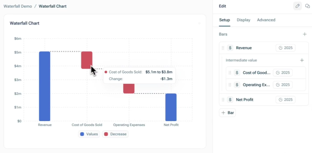
A Waterfall chart is a powerful visualization tool that allows you to drill into the differences between variables, versions, or scenarios, making it an excellent choice for storytelling and analysis, such as the difference between starting ARR and ending ARR, budget vs. actuals, or default vs. aggressive scenarios.
Waterfall charts consist of a starting bar, an ending bar, and intermediate bars that break down the difference between them.
This chart type supports multi-bridge or multi-step waterfalls, where the ending bar of one bridge becomes the starting bar of the next.
To set up a waterfall chart, go to the Setup tab and configure the following:
- Select the time granularity of the data you would like to visualize.
- In the Bars section:
- Set the start value by selecting the desired variable (e.g., Total Revenue) and adjust the time period if needed (e.g., total revenue for 2025).
- Set the end value by selecting the target variable (e.g., Net Profit). The time period will default to match the start value.
- Add intermediate values as needed (e.g., Cost of Goods Sold, Operating Expenses) to show the breakdown of changes.
- If you recorded values as positive values but want to visualize them as negative values (and vice versa), click on the value and activate the option Invert value.
- Optionally, customize the labels for each bar.
Importing Charts
If models are linked, you can easily import charts from one model into another, just like you can import variables:
- Click the + icon on the bottom left in your dashboard and select Import chart.
- Click the model from which you want to import a chart and select or search for the desired chart.
The imported chart will appear alongside your other charts, the only difference being its title is Blue.
Note that if you are giving people access to only the model that imports charts, they will not be able to view the charts properly UNLESS you give them access to the underlying variables and data that the chart leverages. You can do this either by:
- Importing the variables or data that the chart utilizes into the model you are sharing with them
- Giving them access to the sub-models directly