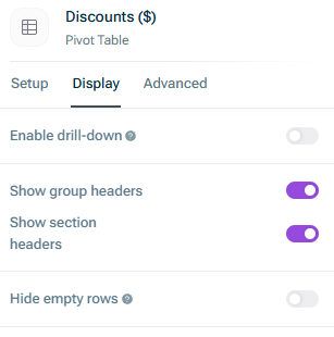
Tables can be used in Lucanet xP&A (Extended Planning & Analysis) to visualize your data in a pivot table, either within the Spreadsheet workspace or the Dashboard workspace.
Tables are helpful if, for example, you want to drill down and see the details on one variable.
To create a table in xP&A, choose one of the following options:
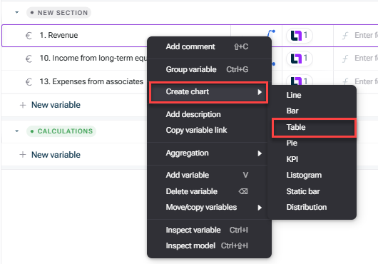
In the spreadsheet workspace, right-click a variable and choose Create chart | Table:
Creating a table from a variable
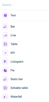
In the spreadsheet workspace, click the Charts icon in the top-right corner to open the Charts side panel and choose New chart | Table.
In the Dashboard workspace, click the + icon at the bottom left and select Table from the displayed list: Creating a table from the side panel or using the + icon
To add the variables you want to visualize, drag & drop them onto an existing table from the spreadsheet workspace (when you have the charts side panel open).
By right-clicking on a table, you can duplicate it (or delete it).
The following general options are available for tables in xP&A:
Option
Description
Commenting a cell
You can add a comment to each cell of a table. Simply hover over the cell you want to comment on and click the yellow comment icon that appears. You can enter your comment in the comment field and save it using Enter or the purple arrow icon.
Comments on a cell are highlighted with a yellow triangle at the top left of the cell. Hover over the yellow triangle to show the comment, all the replies and their authors.
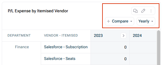
Three-dot menu
You can use the three-dot menu to: • Copy the table as an image • Download the table as an image • Clear annotations and highlights from the table • Add a description • Delete the table
Time aggregation
You can use the roll-up/drill-down column drop-down list to determine how variables are displayed and summed across time (e.g. quarterly, yearly), and toggle between them easily.
Tip: See section Time Aggregation in Aggregation Functions if you want to change how a variable aggregates into quarters or years (the default setting is sum).
Year-to-date roll-up
The Year-to-date roll-up option allows you to see how you are tracking in the year to date.
• The Year can either track the calendar year (i.e. starting in January), or the fiscal year (starting with your fiscal start month, if set). • The to Date can either be to your Last Actual Date, or to today's date. If you use Last actual date, this means that your table will auto-update when you update your Last actual date after a data refresh.
Note:Year-to-date also works across versions and scenarios, for example, you can compare your actual YTD performance with how you thought you would be doing so far from your Budget version.
Relative comparison
You can use this option to compare the value of a variable across relative time periods (e.g. the prior month, the prior year).
In addition, you can choose if you want to show the variance as percentage, value, or both.
Adjust column widths
xP&A has a default column width, but if you have a longer column name (and don't want to hover to see it), you can adjust column widths by dragging the header. Useful shortcuts: • Hold Shift to adjust multiple similar columns at once • Double-click to reset to default width • Hold shift while double-clicking to reset multiple similar columns at once
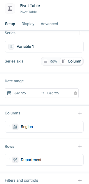
To open the setup options, click the edit icon in the top-right corner of a table visual and go to the Setup tab:
Table setup options
The following setup options are available:
Option
Description
Series
You can easily add, rename, reorder (by drag&drop), and delete variables in the Series section. You can also choose, instead of adding variables one-by-one to a table, to add the entire group or section to the table. The table always stays in sync with the spreadsheet when variables get added or removed from a group or section.
By clicking on a variable in this section, you can: • Change the font style • Define if the values of this variable are editable • Open the advanced setting options
Series axis
Use this section to set whether your variables are displayed as rows or as columns.
Date range
By default, the table will display the entire model date range. If you would like to shorten the date range, you can select a custom start and/or end date for the table here.
Columns/Rows
In this section, you can define which dimensions (e.g. dimensions, scenarios, versions) to include as the rows and columns of the table. By default, Time is included as a column dimension. If your model has its own custom dimensions, you can choose to include those. When including a custom dimension, you can automatically include dimension totals by hovering over the dimension and clicking the Total button.
Notes column
If you click on the + button in the Columns section, you can add a Notes column to your table. The Notes column can be used to add in-line context to your tables, e.g. providing variance analysis for Budget vs. Actuals, or explaining key differences between scenarios.
Filters and controls
In this section you can add filters to the table, e.g. a time filter or a filter to arrange different versions and/or scenarios next to each other.
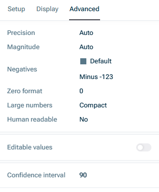
To open the advanced setting options, click the edit icon in the top-right corner of a table visual and go to the Advanced tab. The following advanced options are available:
Advanced table options
For a detailed description of the advanced option Editable values see the following chapter Editable Tables.
They are especially useful when you need end-users, often unfamiliar with spreadsheets, to easily provide their inputs towards a budget (e.g. a department head adding their projected new hires for the upcoming year).
To create an editable table, click the edit icon in the top-right corner of a table visual, go to the Advanced tab and activate the option Editable values.
This content was generated using AI and reviewed by Lucanet subject matter experts before publication.