On this page, you will find information on the structure of the user interface and the main elements in Lucanet Data Collection. From this page, you can navigate to detailed descriptions of the individual workspaces.
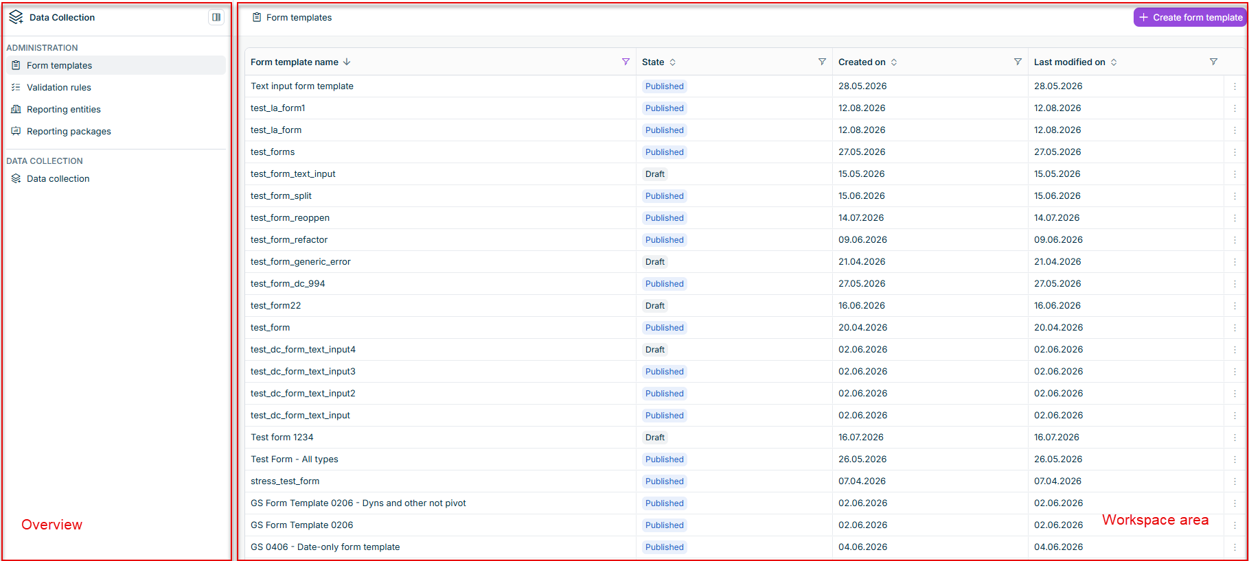
After opening Data Collection from the main menu, the application window is displayed. The user interface is divided into two main areas: the overview on the left and the workspace area on the right.
The workspace area in Data Collection displays the content of the selected workspace. The workspace area consists of two views: a list view and a detail view.
List view
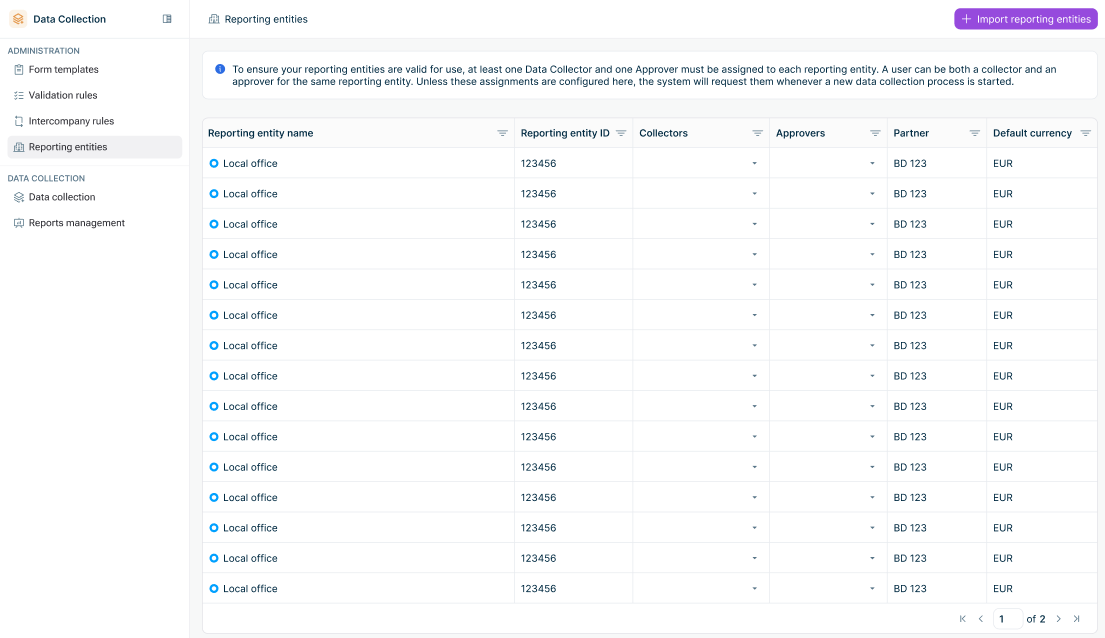
The list view in Data Collection displays all elements in a workspace (e.g., form templates, validation rules, reporting packages) with options to filter, sort, and search. Each list includes an action button to create new elements. The list view is available in all workspaces and is displayed as follows, for example:
List view example
The following table describes the elements that are typically available in the list view in Data Collection:
Element
Description
Element list
Displays all created elements with key information in columns (e.g., name, status, last modified date).
Sorting
By clicking on a column header, the list gets sorted by that column.
Filtering
Each column header includes a filter icon . The filter type depends on the column data type: • Text filter for text columns (Contains, Does not contain, Equals, Does not equal, Begins with, Ends with, Blank, Not blank) • Date filter for date columns (Equals, Does not equal, Before, After, Between, Blank, Not blank with date picker) • Selection filter for columns with predefined values (multi-select check boxes with Select All option)
Pagination
Pagination controls for navigating through large lists
Row actions
Context-specific actions available for each element, for example: • Edit • Delete • Duplicate
Detail view
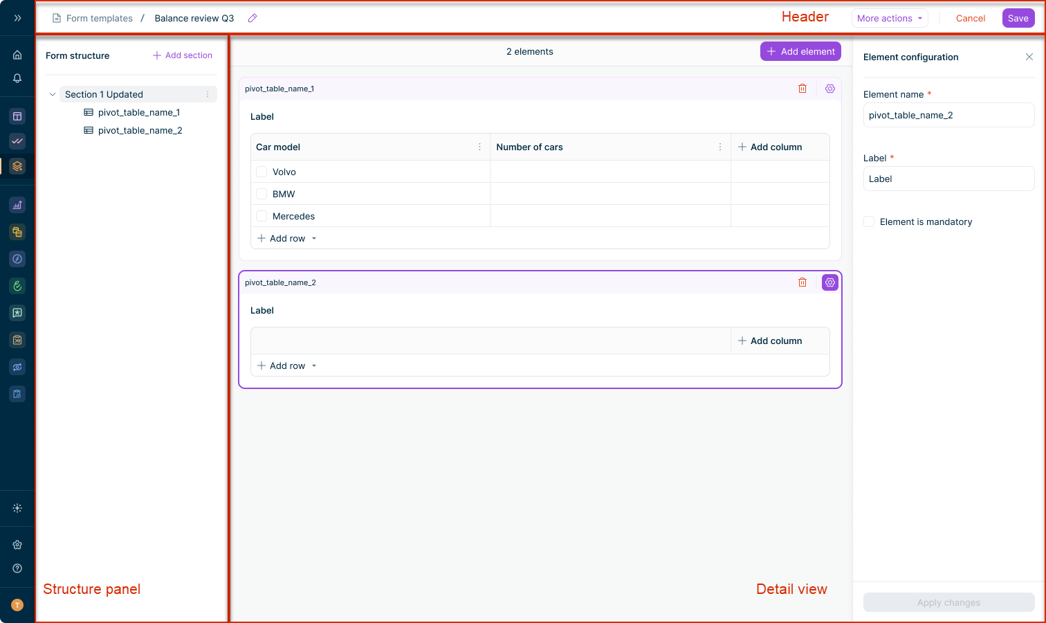
When you select an element from a workspace list in Data Collection, a detail view is displayed where you can configure or edit its content. The form template detail view, shown below as an example, is divided into three main parts:
Detail view example
The following table describes the elements that are typically available in the detail view in Data Collection:
Element
Description
Header
Displays key information about the element and contains action buttons. For forms, the header shows the data collection process name, form name, status, reporting entity, currency, reporting period, and due date.
Structure panel
Available in form templates and forms in data collection processes. Shows the hierarchical structure of sections and elements. Click an element to display the corresponding content in the detail view.
Element detail view
Displays the content of the selected element. Depending on the element type, you can edit form template elements, adjust validation rule or reporting package configurations, or enter data into forms. Elements can be edited as long as their status allows it.
The following table describes the UI elements that are available across workspaces in Data Collection:
Element
Description
Breadcrumb navigation
Shows the current location within the application. Click on any part of the breadcrumb to navigate back.
Action buttons
Context-specific buttons in the top-right corner of the workspace (e.g., Create, Save, Cancel, More actions).
Empty state
Displayed when a workspace contains no elements. Includes a call-to-action button to create the first element.
Status indicator
Shows the current status of an element. Elements such as form templates, validation rules, and reporting packages use the statuses Draft and Published. Forms in the Data Collection workspace use workflow statuses such as New, In Progress, Submitted, and Approved.
This content was generated using AI and reviewed by Lucanet subject matter experts before publication.