In the spreadsheet Right-click a variable and choose Create chart. Click the Charts 
Charts New chart.
In the Dashboard +
In the toolbar of the Spreadsheet Charts 
In the Dashboard
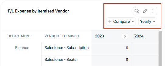
• • • • Add a • | |

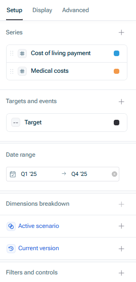
By double-clicking on a variable in this section, you can: • Change the • Plot variables on the • Plot one variable as a • Remove the • Add • Display the variable's • Open the | |
• • • Vertical • | |
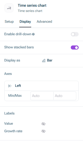
Anyone viewing the dashboard will be able to view these underlying details. Note that this information may be sensitive. | |
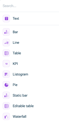
When you choose this option, a text field is displayed. In this text field you can: • Type and format text like you normally would in any other text editor • Add hyperlinks and ordered lists • Reference live variable values by typing /• Mention people in text by typing. • Add headings using the following shortcuts: ###### | |
With a listogram, you can: • Sort a variable by its dimension items, and easily discern which items are the largest/smallest, and their relative proportion to the whole. • Show the breakdown as a percentage or a value, and you can also limit the number of items shown (e.g. if you only want to see the top 10). | |
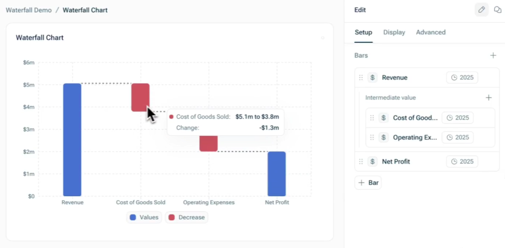
Waterfall charts consist of a starting bar, an ending bar, and intermediate bars that break down the difference between them. This chart type supports multi-bridge or multi-step waterfalls, where the ending bar of one bridge becomes the starting bar of the next. |
Set the start value time period Set the end value time period Add intermediate values If you recorded values as positive values but want to visualize them as negative values (and vice versa), click on the value and activate the option Invert value
This content was generated using AI and reviewed by Lucanet subject matter experts before publication.