Lucanet xP&A (Extended Planning & Analysis) offers different functionalities to compare or aggregate your data in order to gain deeper insights, identify trends, and support strategic decision-making across planning and analysis workflows.
In charts and tables, and in the roll-up columns in a spreadsheet, xP&A can automatically aggregate a variable's values across time.
Example: If your model is monthly and you have a Revenue variable, then xP&A can automatically summarize the total revenue in each year.
The time aggregation function lets you choose how this summary is calculated. The following options are available:
Sum
Sums up the individual values, e.g. anything that represents a discrete quantity which can accumulate, e.g. "Revenue"
Average
Calculates the mean of the individual values, e.g. generally anything that's a percentage, like "Growth rate"
Final
Takes the final value in the set of individual values, e.g. anything representing an accumulation, like "Total users" or "Cash in bank", or a percentage that you expect to move roughly monotonically
Initial
Takes the first value in the set of individual values
Formula
Uses the variable's formula to calculate an aggregation value, e.g. if you have a variable for the margin with the formula profit / revenue, the formula aggregation will take the total profit and divide it by the total revenue of the aggregated period.
You can set up the time aggregation as follows:
In charts and tables
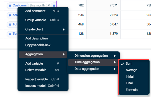
Right-click a variable and choose Aggregation | Time Aggregation and then the desired aggregation methods from the context menu:
Time aggregation menu on a variable
In roll-up columns
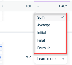
If you have roll-up columns toggled on, you can click a rollup cell to easily edit the Time aggregation setting for each variable:
For example, when a model with lower granularity (such as Monthly) pulls data from a model with higher granularity (such as Weekly), the time aggregation setting determines if it should pull the sum, the average, the final etc.
For more information on aggregation functions for data and dimensions, see Aggregation Functions.
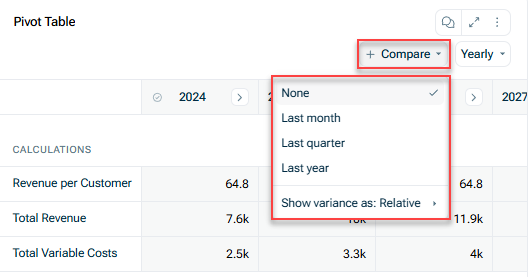
You can easily compare the value of a variable across relative time periods (e.g. the prior month, the prior year). The comparison is shown on a time aggregated basis too, if relevant.
For example, if your model is monthly and you have set your table to yearly time aggregation with the showing the variance as a relative comparison, a Year-over-Year Comparison (YoY) will show for 2025 vs. 2026, as well as each month (e.g. Jan 2025 vs. Jan 2026).
Comparisons in charts
This content was generated using AI and reviewed by Lucanet subject matter experts before publication.