Widgets are the building blocks of a dashboard. You can position and resize each widget on the dashboard grid. Most widget types visualize data from a single data source; the Text box widget instead holds free-form text. This page describes the available widget types and how to add, configure, and edit a widget.

The following widget types are available:

Widget typeDescription
KPIDisplays a single key figure as a card.
BarDisplays values over time as a bar chart.
LineDisplays values over time as a line chart.
Static barDisplays values compared across categories as a bar chart.
WaterfallDisplays the effect of a series of positive and negative changes on an initial value.
PieDisplays values as proportions of a whole.
ListogramDisplays values as a ranked list.
Text boxDisplays free-form text, such as notes or commentary.

To add a widget to a dashboard:

1

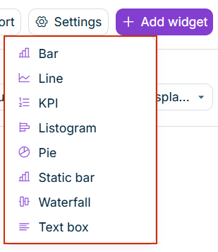
Open the dashboard and click Add widget. The list of widget types is displayed as follows, for example:

The list of widget types displayed from the Add widget button.
List of widget types
2

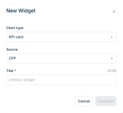
Select a widget type. The New Widget dialog is displayed as follows, for example:

The 'New Widget' dialog with the Chart type, Source, and Title fields.
'New Widget' dialog
3

Select the Chart type and enter a Title. The title can have up to 100 characters.

4

Click Continue.

5

Configure the widget on the General, Data, and Appearance tabs (see below). A live preview on the left updates as you adjust the configuration.

6

Click Add widget to place the widget on the dashboard.

The New Widget dialog organizes the configuration into three tabs.

The General tab contains the widget's Title and an optional Description. For a Text box widget, the General tab instead contains a Headline and a Text field. For each, you can set the font size (S, M, or L) and bold formatting.

The Data tab defines which data a widget displays. It is available for all widget types except Text box. For a widget with the source CFP, you can configure the following:

  • Ledger: the ledger from which the values are taken.
  • Element: the account, item, or formula whose values are displayed.
  • Transaction currency, Partner, Adjustment level, and Data level: the Lucanet dimensions applied to the values. For more information, see Dimensions.

The available options differ by widget type:

  • KPI additionally provides a Transaction type option.
  • Pie and Listogram provide a Break down by option (Accounts/items or Organization elements).
  • Waterfall does not use a single Element. Instead, it provides a Waterfall flow in which you select a Start point and an End point and add up to 18 elements in between that make up the change from the start value to the end value. For example, a waterfall can show the path from revenue as the start point to net income as the end point, with items such as cost of goods sold, operating expenses, and taxes as the contributions in between.
  • The Time period, Organization element, and Currency are determined by the dashboard filters, not set per widget. For more information, see Managing Dashboards.
  • The Source field defines the widget's data source. It cannot be changed while creating or editing the widget.

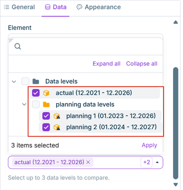
For the KPI, Bar, Line, Static bar, and Listogram widget types, you can select up to three data levels in the Data level option and compare them in a single widget, for example one actual data level and two planning data levels.

The Data level option is displayed as follows, for example:

The 'Data level' option with the opened list and three selected data levels.
'Data level' option with three selected data levels

The following applies to all selected data levels:

  • All other options of the widget and all dashboard filters apply to every data level. The data level is the only dimension in which the compared values differ.
  • The period of the widget covers the periods of all selected data levels.

How the comparison is displayed depends on the widget type:

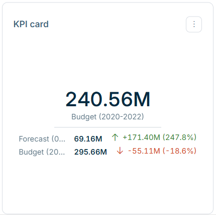
  • KPI: The data level that is selected first is displayed as the main value. Each further data level is displayed below the main value with its own value and the difference from the main value, as an absolute value and as a percentage.
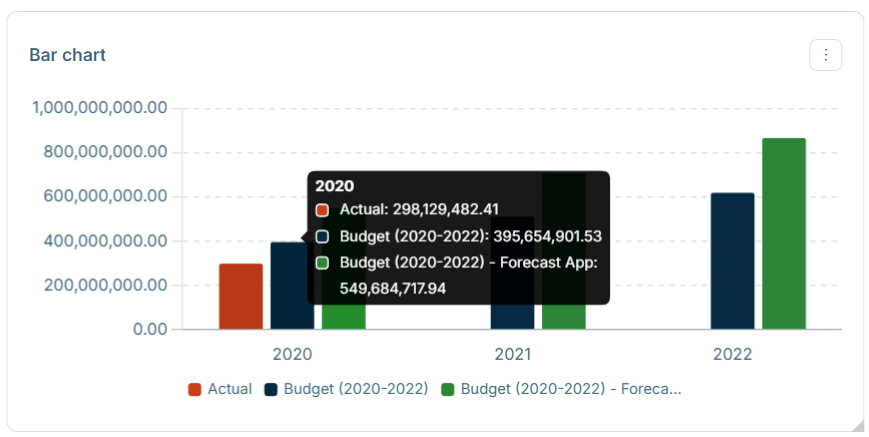
  • Bar, Line, Static bar, and Listogram: Each data level is displayed as a separate series in a color of the selected color palette. The legend identifies each series by the name of the data level.

A KPI widget with three data levels is displayed as follows, for example:

A 'KPI' widget with the value of the first data level as the main value and the values and differences of two further data levels below it.
'KPI' widget with three data levels

At least one data level must be selected. For the Pie and Waterfall widget types, the comparison is not available.

The Appearance tab contains the Colors option, where you choose a color palette for the widget. The widget cycles through the colors if there are more data points than colors. The Appearance tab is not available for the KPI and Text box widgets.

Each widget has a three-dot menu Three-dot menu icon with Edit and Delete options. Edit reopens the widget configuration; Delete removes the widget from the dashboard and cannot be undone.

Only the dashboard owner can edit or delete widgets. Viewers and administrators see the configured widgets only, without being able to edit or delete them.

This content was generated using AI and reviewed by Lucanet subject matter experts before publication.