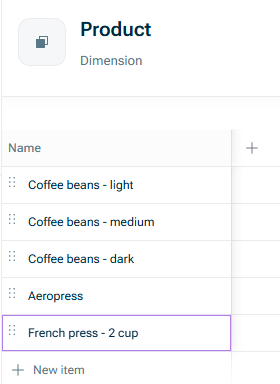
Suppose that you add a new product to your offering.
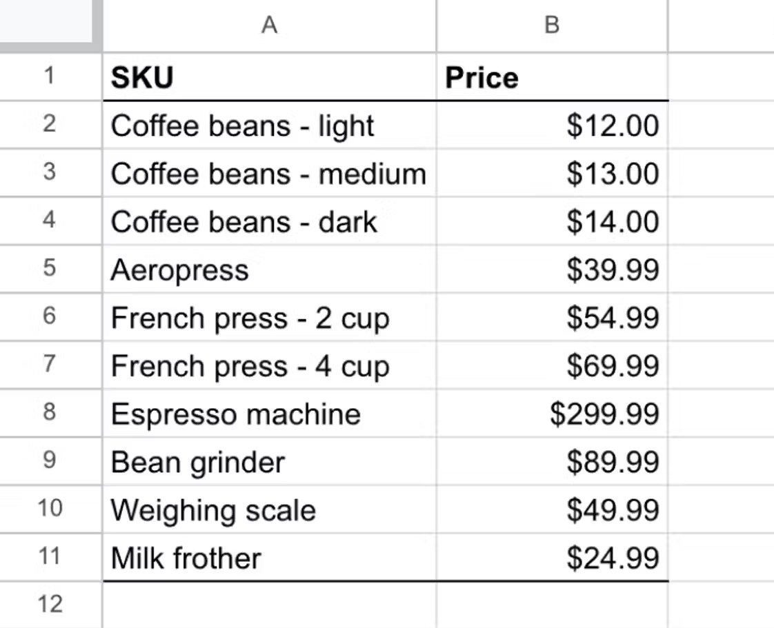
In a spreadsheet you would have to find every instance of your product list in your model, insert a new row in the right place, and then fill in the correct formula for it.
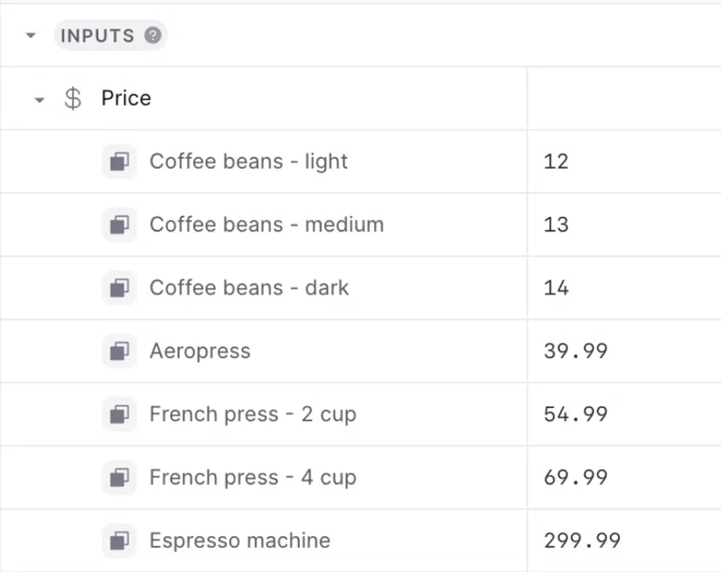
In xP&A, you can simply add your new product to your SKU dimension, and xP&A will automatically include it wherever the SKU dimension is used.
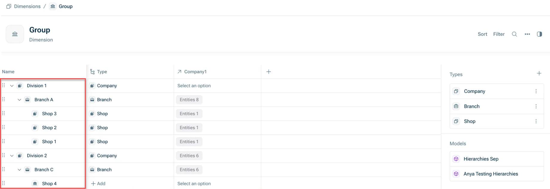
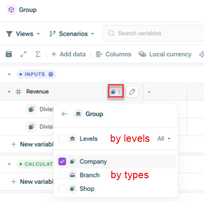
If your dimension has an inherent hierarchy, e.g. your dimension is Group and contains Divisions, Branches, and Shops that are rolled up, you can build your dimension in order to display and aggregate data at the corresponding level.
To create this hierarchy in the dimension settings, simply grab a dimension item on the left and drop it under the dimension it belongs. This automatically assigns levels (top items are level 1, their children level 2, and so on). For more information, see Creating and Editing Dimensions.
In the following example, Division 1 is level 1, Branch A is level 2 and Shop 1, 2 and 3 are level 3:
You think about your products falling into two different groups: Coffee beans and Coffee equipment.
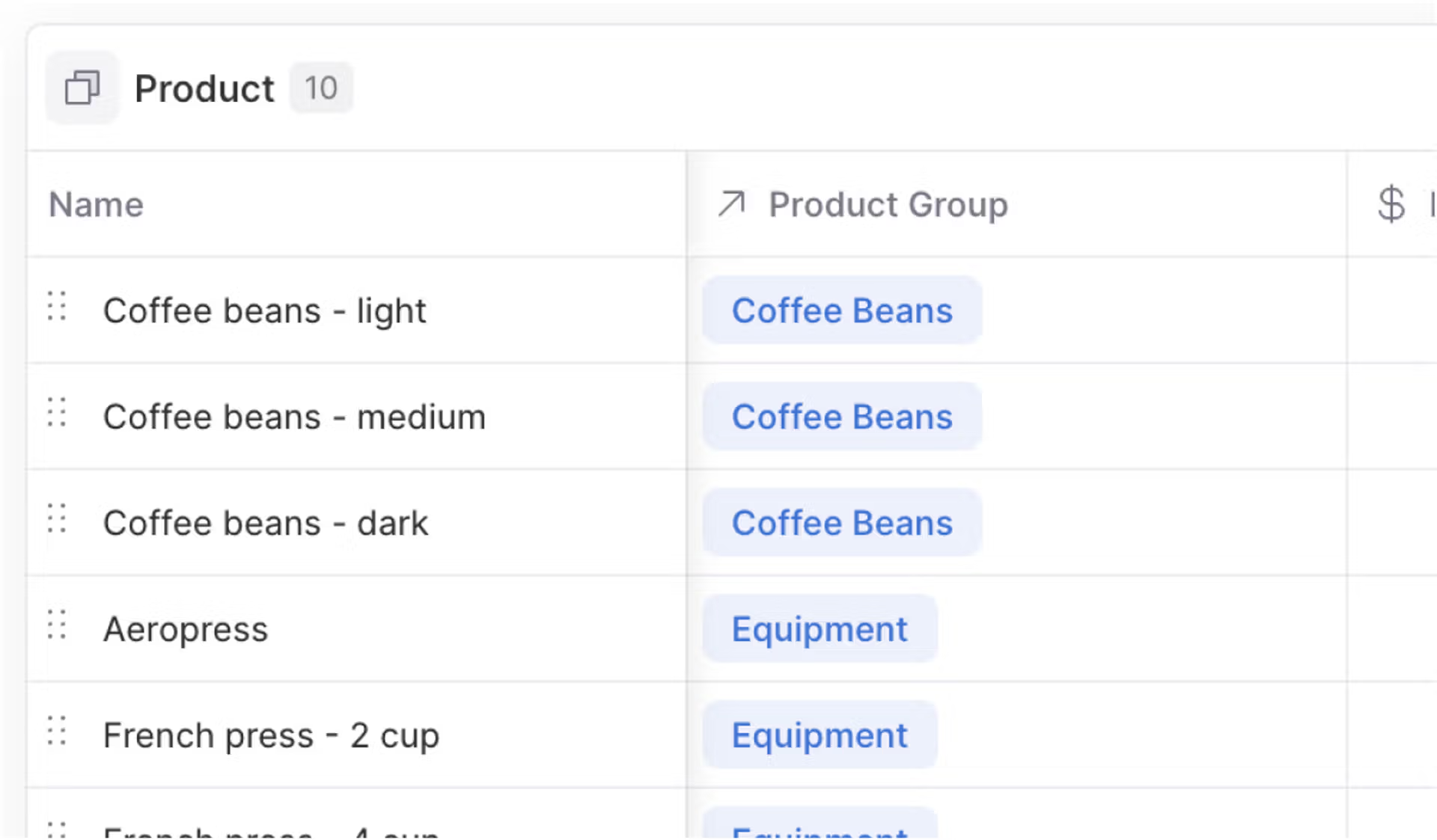
In xP&A, you can create a dimension called Product Group, link it to the SKU dimension, and then assign each SKU to a Product Group. (For more information, see Creating and Editing Dimensions.)
Suppose that your taxes are not just 20% across all products, but that there is a different tax payable on food (e.g. coffee beans) versus coffee equipment.
In a spreadsheet, you would do the following:
1
Set up a lookup table between SKU and Product Group
2
Break your tax assumption out into separate values for each Product Group
3
Replace your tax calculation formulas with VLOOKUPs (or similar) to use the correct tax amount for each product
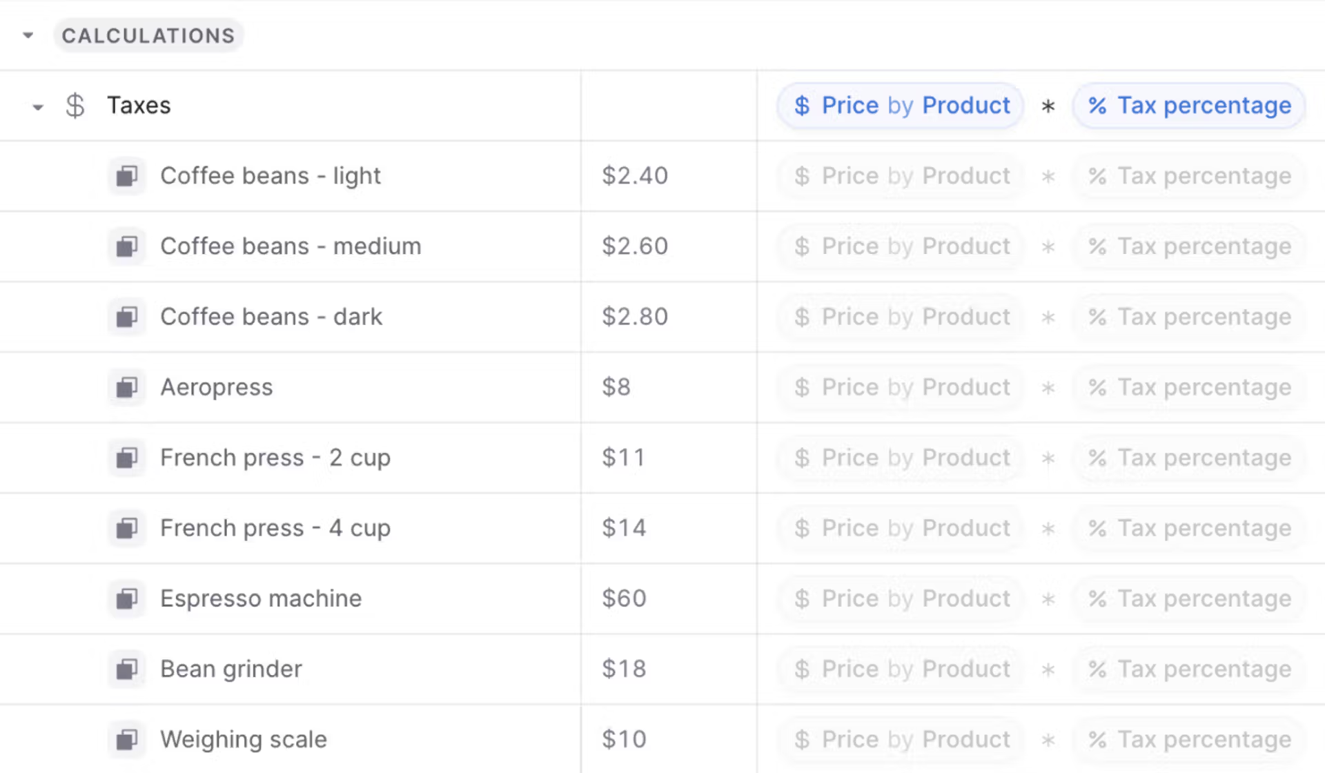
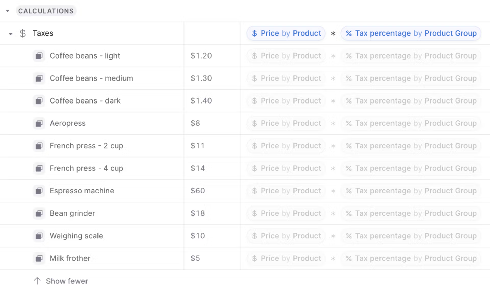
In xP&A, you can simply apply the Product Group breakdown to your Tax variable, and xP&A will automatically use the correct tax amount for each product in your downstream calculations.
Applying the 'Product Group' breakdown to the tax variable
Price is broken down by Product while Tax percentage is broken down by Product Group, but xP&A lets you multiply them directly without any manual lookups.
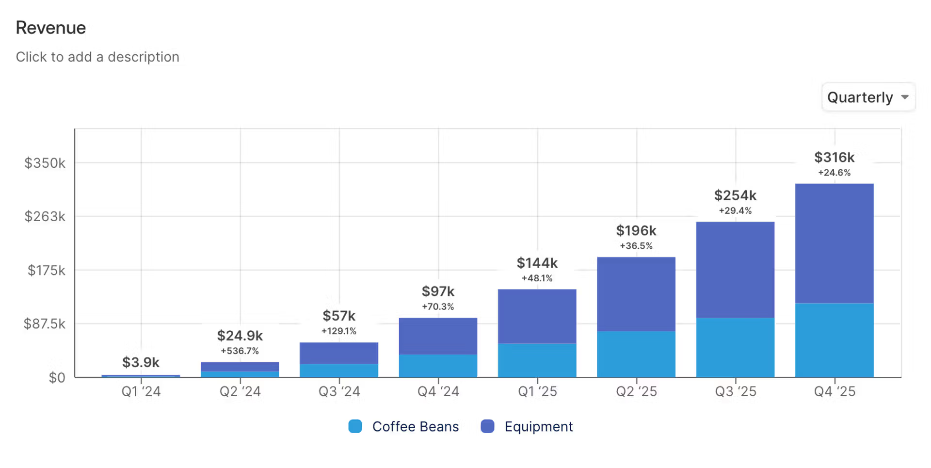
Suppose that you have your monthly revenue broken down by SKU and want to create a stacked bar chart showing your monthly revenue broken down by Product Group.
In a spreadsheet, you would have to first “pivot” your data (using formulas and copy&pasting) and then chart the pivoted version of the data.
In xP&A, you can simply create a chart of your Revenue variable, and then pivot the data directly on the chart without any setup.
Every business is messy, and sometimes you will need to hardcode certain values or set different formulas for different periods.
You can override any dimension value by simply clicking and typing into the relevant cell. This is a useful 'escape hatch', but should be used sparingly!