This page uses two concrete use cases to demonstrate how you use widgets in Banking & Cash Management — from the empty canvas to the fully configured chart. Widgets are the building blocks of a dashboard: Each widget displays specific data as a standalone visual element, for example as a pie chart or line chart.

The examples on this page demonstrate:

  • Example 1: Balance distribution as a pie chart — visualization of the distribution of balances by company
  • Example 2: Balance development per company as a line chart — display of the balance development of several companies over time

Both examples describe all working steps in the order in which you also execute them when creating your own widgets.

Before you start creating dashboard widgets, make sure that:

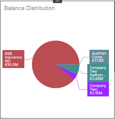
This example demonstrates how you create a pie chart that visualizes the distribution of balances by company.

An example of a pie chart is displayed.
An example of a pie chart

To add a widget to the dashboard:

1

Activate the design mode.

2

Drag and drop the Pies widget from the widget toolbox to the desired position in the dashboard, or click the widget in the widget toolbox once.

All data for dashboards comes from Banking & Cash Management. As a data source, you add one of the predefined data sources to the dashboard, for example Account balance for account balances. You add data sources at dashboard level so that all widgets in the dashboard can access them.

To add the data source:

1

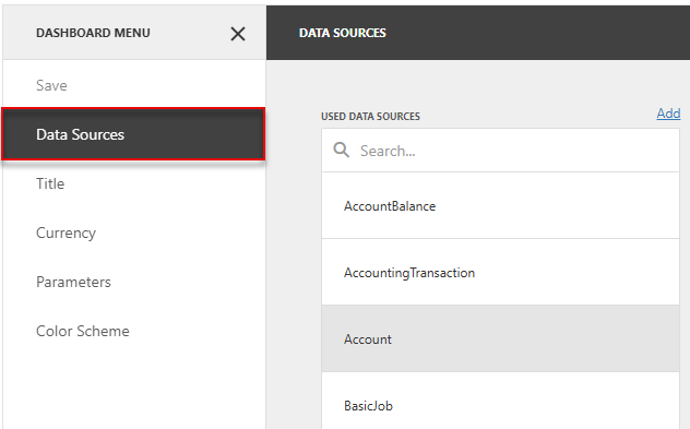
Click the Menu icon (☰) in the upper left corner of the dashboard area. The dashboard menu is displayed.

2

Click Data Sources. The Data Sources area is displayed:

The dashboard menu with the open Data Sources area is displayed.
'Data Sources' area in the dashboard menu
3

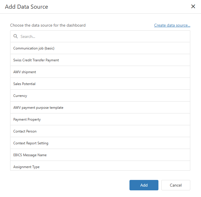
Click Add. The Add Data Source dialog is displayed:

The Add Data Source dialog is displayed.
'Add Data Source' dialog
4

Select a data source — in this example Account balance — and click Add.

With Bindings, you define which data is displayed in the pie chart. In doing so, you bind the selected data from Banking & Cash Management to the elements of the pie chart. The section Bindings describes the meaning of the individual fields.

To configure the bindings:

1

Click the newly created pie chart widget.

2

In the widget editing options, click the binding icon ().

3

Configure the bindings as follows:

FieldValue in this example
ValuesBalance (EUR) (Sum)
ArgumentsAccount Holder: forms the segments of the pie chart
SeriesEmpty: not required for a simple pie chart
Hidden DimensionsDate (Day-Month-Year)
Hidden MeasuresEmpty: not required
Data SourceAccount balance: the data source added previously

With filters, you restrict the data displayed in the widget in a targeted way — for example to specific periods or companies — without changing the underlying data sources. The section Filter describes the meaning of the individual fields.

To configure the filters:

1

Click the newly created pie chart widget.

2

In the widget editing options, click the filters icon ().

3

Configure the filters as follows:

FieldValue in this example
Item FilterFilter expression [Date (Day-Month-Year)] = Today(): displays only the data of the current day
Visible Data FilterNot configured

With interactivity, you turn the dashboard into a dynamic analysis tool: Widgets can filter other widgets as master filters, and drill down allows navigation to deeper levels of detail. The section Interactivity describes the meaning of the individual fields.

To configure the interactivity:

1

Click the newly created pie chart widget.

2

In the widget editing options, click the interactivity icon ().

3

Configure the interactivity as follows:

FieldValue in this example
Master Filter ModeNone
Drill DownOFF
Target DimensionsArguments
Ignore Master FiltersON
Cross-Data-Source FilteringOFF

The options determine the visual appearance of the widget — for example colors, labels, and legends. The section Options describes the meaning of the individual fields.

To configure the options:

1

Click the newly created pie chart widget.

2

In the widget editing options, click the options icon ().

3

Configure the options as follows:

Style

FieldValue in this example
StylePie: display as pies

Common

FieldValue in this example
Show CaptionON
CaptionBalance distribution
Show Pie CaptionsOFF

Layout

FieldValue in this example
Content Arrangement ModeAuto
Number of RowsOnly relevant if Fixed Rows is selected as the arrangement mode

Labels

FieldValue in this example
Data LabelsArgument and Value: displays company names and amounts
TooltipsArgument, Value and Percent: displays all information when you move the mouse pointer over a segment
Label PositionOutside

Coloring

FieldValue in this example
Measures ColoringAuto
Arguments - Account HolderAuto

Color Scheme

Displays the individual color assignment for each category. Use the edit icon next to each category to adjust the color individually.

FieldValue in this example
Color scheme typeGlobal: ensures consistent colors for companies across all widgets

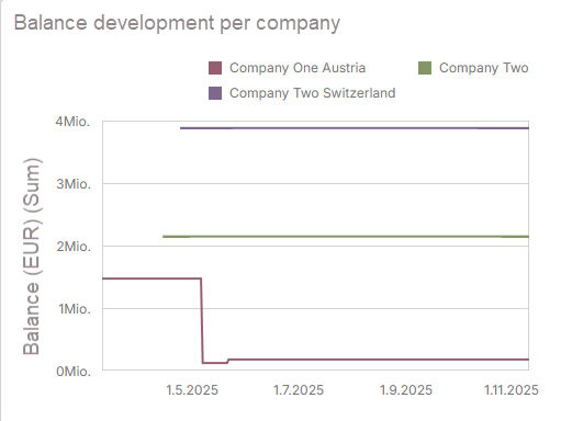
This example demonstrates how you create a line chart that visualizes the development of balances for several companies over time.

An example of a line chart is displayed.
An example of a line chart

To add a widget to the dashboard:

1

Activate the design mode.

2

Drag and drop the Chart widget from the widget toolbox to the desired position in the dashboard, or click the widget in the toolbox once.

This example uses the same Account balance data source as example 1. If you have not yet added the data source, follow the steps in example 1.

With Bindings, you define which data is displayed in the chart. In doing so, you bind the selected data from Banking & Cash Management to the elements of the chart. The section Bindings describes the meaning of the individual fields.

To configure the bindings:

1

Click the newly created chart widget.

2

In the widget editing options, click the binding icon ().

3

Configure the bindings as follows:

FieldValue in this example
ValuesBalance (EUR) (Sum): the Y-axis of the chart
ArgumentsDate (Day-Month-Year): the time axis on the X-axis
SeriesAccount Holder: creates a separate line for each company
Hidden DimensionsEmpty: not required
Hidden MeasuresEmpty: not required
Data SourceAccount balance: the data source added previously

With filters, you restrict the data displayed in the widget in a targeted way — for example to specific periods or companies — without changing the underlying data sources. The section Filter describes the meaning of the individual fields.

To configure the filters:

1

Click the newly created chart widget.

2

In the widget editing options, click the filters icon ().

3

Configure the filters as follows:

FieldValue in this example
Item FilterFilter expression [Date (Day-Month-Year)] = Today(): displays only the data of the current day
Visible Data FilterNot configured

With interactivity, you turn the dashboard into a dynamic analysis tool: Widgets can filter other widgets as master filters, and drill down allows navigation to deeper levels of detail. The section Interactivity describes the meaning of the individual fields.

To configure the interactivity:

1

Click the newly created chart widget.

2

In the widget editing options, click the interactivity icon ().

3

Configure the interactivity as follows:

FieldValue in this example
Master Filter ModeNone
Drill DownOFF
Target DimensionsArguments
Ignore Master FiltersOFF
Cross-Data-Source FilteringOFF

The options determine the visual appearance of the widget — for example colors, labels, and legends. The section Options describes the meaning of the individual fields.

To configure the options:

1

Click the newly created chart widget.

2

In the widget editing options, click the options icon ().

3

Configure the options as follows:

Common

FieldValue in this example
Show CaptionON
CaptionBalance development per company
RotatedOFF

X-Axis

FieldValue in this example
ReverseOFF: normal time axis from left to right
VisibleON
TitleOFF: no axis title, as the date is self-explanatory
Title TextDate (Day-Month-Year): only displayed if Title is activated
Enable ZoomingOFF
Limit Visible PointsOFF: all data points are displayed
Visible Points CountOnly relevant if Limit Visible Points is activated
Format TypeDefault

Y-Axis

FieldValue in this example
Always Show Zero LevelON: the Y-axis always starts at 0
ReverseOFF
Grid LinesON: horizontal grid lines make it easier to read the values
VisibleON
TitleON
Title TextBalance (EUR) (Sum)
Logarithmic ScaleOFF: linear scaling
Logarithmic Scale BaseOnly relevant if Logarithmic Scale is activated
Format TypeAuto
UnitAuto
Precision2
Include Group SeparatorOFF
CurrencyUse Client System Settings

Legend

FieldValue in this example
Show LegendYes
Inside DiagramNo: the legend is positioned outside the chart area
PositionTop Right Horizontal: top right, aligned horizontally

Conditional Formatting

FieldValue in this example
Conditional FormattingNot configured

Trend Indicators

FieldValue in this example
Trend IndicatorsNot configured

Coloring

FieldValue in this example
Arguments - Date (Day-Month-Year)Auto
Series - Account HolderAuto
Measures ColoringAuto

Color Scheme

Displays the individual color assignment for each category. Use the edit icon next to each category to adjust the color individually.

FieldValue in this example
Color scheme typeGlobal: ensures consistent colors for companies across all widgets

To change the size of a widget, drag the corners or edges of the widget in design mode.

The W: and H: settings in the design toolbar define the width and height of the entire dashboard, not the size of an individual widget.