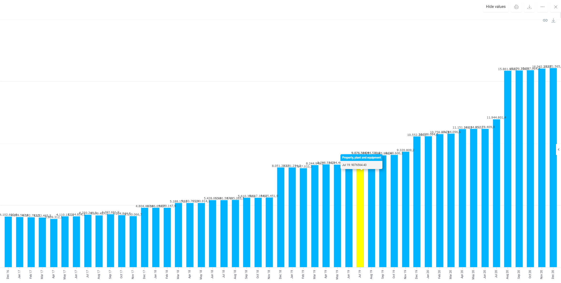
Values of items and accounts from ledgers and schedules can be visualized in Charts as column, bar, pie or line charts. To visualize comparisons, the values of multiple items or accounts can be displayed in a chart at the same time.
Alternatively, you can find the information in the following video:
Video — https://player.vimeo.com/video/852368020?muted=false&autoplay=false&loop=false&playsinline=true&controls=true&portrait=false&byline=false&title=false
The video also offers Spanish subtitles. To enable Spanish subtitles, click the CC button in the bottom-right corner, then use the gear icon (Settings) to select Español.
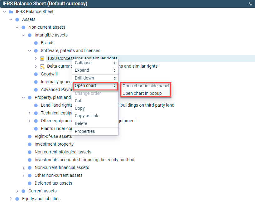
Charts can be opened from the context menu for items and accounts in the side panel or as a pop-up window:
Opening a chart via the context menu
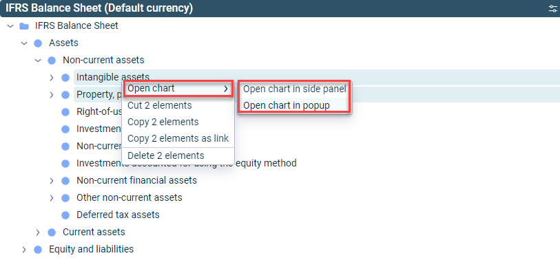
For comparisons, several items or accounts can be included in a chart at the same time. To display two or more accounts or items in a chart, you must select these accounts or items while holding down the CTRL button:
Opening a chart for two items
The chart is then displayed as follows:
Displaying fixed assets and current assets as a chart
The toolbar of a chart is displayed as follows, for example:
Toolbar of a chart
The following options are available in the toolbar of a chart:
Option
Description
Display/hide values
Shows or hides the values of bars, columns, pie segments, or lines
Drop-down list
Changes the position of the chart
Print (print icon)
Opens the operating system's print dialog from where the chart can be printed
Download (download icon)
Downloads the chart in PNG format
More options (three dots icon)
The following additional options are available per chart: - Settings — Choice of chart type (e.g. column, bar, pie, line) - Data — Show or hide data for an item or account from the chart - Format — Chart type-specific settings for the chart layout. For example, in a bar chart the following elements can be configured: Title, Padding, Background, Labels, Shadow, Navigator
This content was generated using AI and reviewed by Lucanet subject matter experts before publication.